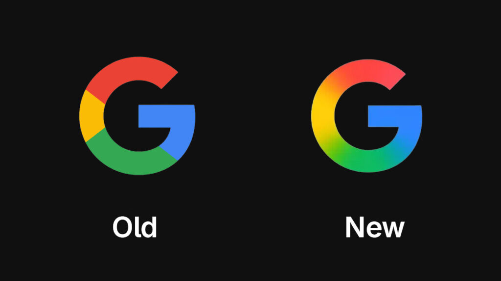
The first significant makeover of Google’s iconic “G” logo in almost ten years is being unveiled today. The new design substitutes a gradient effect that smoothly switches between the colors for the traditional four-color blocks of red, yellow, green, and blue. This little change attempts to give the emblem a more modern, fresh look, reflecting Google’s continued emphasis on artificial intelligence.
A 9to5Google story claims that the update has started to show up on Android devices with the release of Google app beta version 16.18 and is presently being distributed to iOS users via the Google Search app. Even though the change isn’t very noticeable, especially at smaller sizes, it represents a more general visual change in Google’s design approach that is consistent with its most recent AI-driven projects.
Also check:- Launch date of Samsung Galaxy S25 Edge in 2 days: All that we know
The primary Google wordmark has not yet been altered by the business. Additionally, it is not officially confirmed if other product logos, such as those of Maps or Chrome, would receive the same revisions. The gradient design might, however, eventually be extended to other services given Google’s concentration on AI across all of its products.

With this upgrade, Google hasn’t changed its “G” logo since 2015. The new gradient design represents the company’s changing brand identity as it incorporates more AI functions, especially with the introduction of Google Gemini, its generative AI assistant. A blue-to-purple gradient is already present in Gemini’s logo, further indicating Google’s move toward dynamic, gradient-based design.
The older “G” icon is still in use on other platforms, including web and Android devices that are not Pixels, but the new one is currently visible on iOS and Pixel smartphones. In the upcoming weeks, it is anticipated that the new design will be more extensively available on various platforms and devices.

